Modern Marvels
DKOR Interiors Gives Couple Their Dream SpaceStory by Josie GulliksenPhotos by Alexia FodereNorth Miami-based design team at DKOR Interiors, along with Principal Ivonne Ronderos and lead designer Karina Donadel, recently completed a home renovation project in North Miami Beach's luxurious Presidential Estates in six months and the results are breathtaking. Accustomed to designing client's vacation residences here, they were creating a family's dream home in which they plan to reside in for 10 to 15 years."We knew we were creating something this couple had been working toward for many, many years," said Ronderos. "Because of this, we dubbed the project 'Mrs. Miami Modern Home.'"With hundreds of people involved, collaboration of trades was vital to completing the project between January and July. Knowing each designer at DKOR has a specific strength and talent, the project was divided in-house among them. Ronderos said that lighting design, carpentry design, concept development and more were executed in harmony, with impeccable attention to detail and aesthetics."The DKOR designers' teamwork was the key to our success on this project, carrying through from start to finish," Ronderos said. "I particularly loved their keen eye and unique use of conventional materials, especially those used on walls and ceilings throughout."At 4,500-square-feet, creating the couple's dream home meant work on virtually every major room, including bedrooms of the three young children."The seven-year-old was excited about his grown up room which fueled the DKOR team's design inspiration for his fun bedroom," said Donadel. Staying true to the major design element, they distinguished the space by interrupting the continuous wrap and brought the floor carpet tiles up the walls and stopped the Braille patterned tiles from allmodern.com at the foot of the bed to encompass the sleeping area. The blue sphere chair from Inmod.com and blue suspension lamp over the bed from Kartell give the room its modern feel.
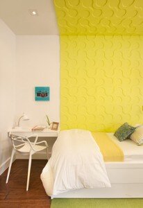
 In the bright, lime-lemon yellow bedroom that the two boys' shared, the challenge was function -- how to fit two beds, two desks, two nightstands and storage, since it was immediately evident individual pieces would not work."We designed two units, each with necessary multiple functions incorporated as one," Donadel said. "Aesthetically, we wanted to unite the two sides with a single visual element, which became the wall panels and Flor carpet tiles." Custom-made green accent pillows complement the two beds while the airy DKOR custom-made linen ripple fold drapes frame the windows and children's artwork perfectly.In the couples' extended master bedroom, the headboard wall became a large blank canvas and the design's jumping point. "We sectioned the wall in three and combined two materials to break up the large area, while using clean lines to separate the panels and maintain the consistent crispness of the overall design," said Donadel. Continuing the multi-function theme, "the wall unit serves as dresser, desk, storage and space for the television, and like other carpentry in the room, addresses the design concept by wrapping elements."The soft creams and browns like the fully upholstered off-white leather bed by Jesse Italy purchased from Arravanti Showroom, and matching custom-made headboard work with the pinch-pleat drapes that accentuate the bay window. Custom Carpentry-designed nightstands feature Fine Line bedside lamps with tall and slender vertical drum shades. A rich, luxurious, long pile, hand-knotted, bamboo silk custom area rug from Lilypads Creations, Inc. plays well off the wood flooring and the Casadeus angelo modern style chaise behind the bed is the perfect reading spot.
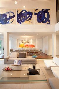
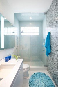
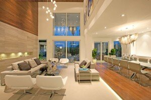
 The bathrooms had to feel airy incorporate natural textures and remain minimalist. Like the rest of the home, the bathroom's functionality specifically addressed the clients' needs, from the vanity designs incorporating hamper drawers to the positioning of the shower controls. Enclosing the toilet area with opaque glass panels creates airiness, while shower walls surrounded with river rocks creates a unique showering experience complementing the rain head fixtures. The monochromatic palette and the self-lit mirror add to the clean design, while the hanging air plants add a warm and playful touch.In the living room, the tall ceiling became the focus of the entire home's design element. "We established the home's aesthetic would be 'warm modern,' so applying wood on the ceiling and adjacent wall came naturally in the design process," Donadel said. This wrapping concept set the tone for the entire home. Limestone then "added the right amount of texture and created a clean line of contrast with the wood," she said.The Star Fired Frosted Glass entry doors by Aqua Showers separate the office and living room and serve to hide any office clutter. "In the office, the color contrast of the perimeter cabinetry, along with the beautiful central pendant, added interest and playfulness without being childish," said Donadel.In the living room, the round pendant Bocci is comprised of 36 cast glass pendants connected with braided steel coaxial cables to a round white powder coated canopy. The wood wall with built-in lighting that extends onto the ceiling is Plyboo Havana Strand Bamboo Flooring while the bottom half of the wall is Vena Grigio stone also with built-in lighting. Two clean-line tan square-single seat sofas by Minotti are separated by a glass coffee table adorned with a Michael Dawkins Home hand-blown clear glass sculpture, a Donna Karan pewter-plated metal oval tray that lends an organic ocean aura to the room and over scale candles by Jean Marie Massaud. B&B Italian white metropolitan chairs and Warren Platner-designed side tables are equally streamlined and the swirl blue abstract piece by artist Antillion adds color and ties in the ocean theme.The wrapping element is also featured in the family room through carpentry. "The clients wanted to relax as a family and also include a bar function for casual entertaining. So the wall unit holds family-related items and AV components while also serving as a fully functioning bar hidden behind the pantry-like doors. The chartreuse pops of color inside the open storage made the wall-to-wall unit feel balanced and added punch to the otherwise minimal room.Working jointly on the living and dining rooms solved the problem of the couple needing to seat 14 people at once, impossible in the existing space."We designed the two spaces together, but needed to delineate a separation and simultaneously keep an open concept. The wood platform grounds the dining room as its own unit and helps the composition of the two spaces relate as one. The custom buffet provides the clients with enough storage without overbearing the room."The simple chrome leg Minotti dining room table is long enough to accommodate five Lignet Roset Sala armless dining chairs with chrome sleigh base on each side lengthwise and two at each end. The chandelier is a Terzani Atlantis Long Suspension, small, nickel plated.Donadel describes the chandelier as "seemingly alive, Atlantis shimmering light creates a vibrant source of energy. Its mesmerizing, organic effect is created by hundreds of illuminated lengths of draped chain. Like water in the ocean, Atlantis chains appear liquid, cascading over its polished bands and falling down towards the abyss before turning back into itself."As the central daily gathering space for preparing large meals, the kitchen was transformed into the home's single largest space. The room's natural light was enhanced with reflective materials for the upper cabinet doors and backsplash. The walnut base cabinet finish and lavastone cantilevered counter introduced organic textures needed to make the modern kitchen inviting. A white Flor oval dining table, green Panton chairs in Chartreus and modern wire mesh bar stools are ultra-modern.
 Also a public area, Donadel said that "the powder room needed to relate to the living and dining room, hence the wood wrapping, yet we wanted to surprise people when they stepped in, and the Alex Turco acrylic art piece was the striking ingredient the room needed."